Visual Design
Objectives
- Information communication - enforce desired relationships and avoid undesired ones
- Aesthetics - well designed, complete, well ordered, professional, attractive
"Brand" - recongizable as being part of your organization
Impose as little thinking as possible on your users
Gestalt Principles
- Theories of visual perception that describe how people tend to organize visual elements into groups or unified wholes, when certain principles are applied
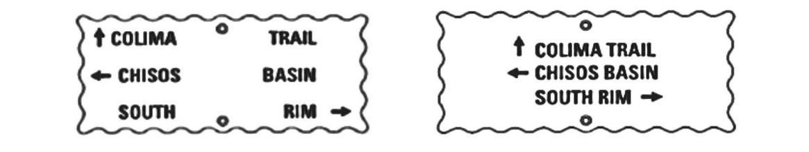
Prioximity
- Individual elements are associated more strongly with nearby elements than with those further away
Similiarity
- Elements associated more strongly when they share basic visual characteristics
Continuity
- Elements arranged in straight line or a smooth curve are preceived as being related
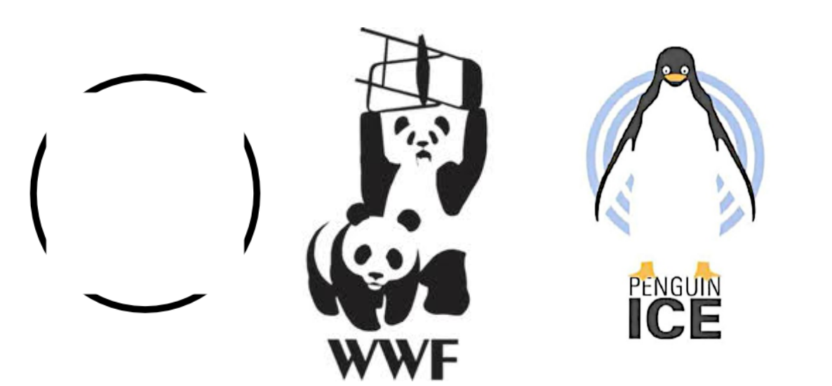
Closure
- The visual system perceives a set of individual elements as a single, recognizable pattern, rather than individual elements
 Connectedness
- Elements connected to one another by uniform visual properties are perceived to be more related than elements that are not connected
- Connecting lines or connecting regions

Grouping
- Group elements into higher order units
- e.g. Newspapers have paragraphs, columns, sections pages
- User the Gestalt principles
Hierarchy
- A visual hierarchy guides and allows information scanning
- Support intended reading sequence
Relationship
- Establish relationships between elements by using position, size, value (colour, shape, etc.)
- Alignment and similarity is effective in creating relations
Balance
- Try to create a stable composition by balancing elements
- Stability achieved by manipulating properties such as position, size, hue, form
- Symmetric layouts naturally achieve balance
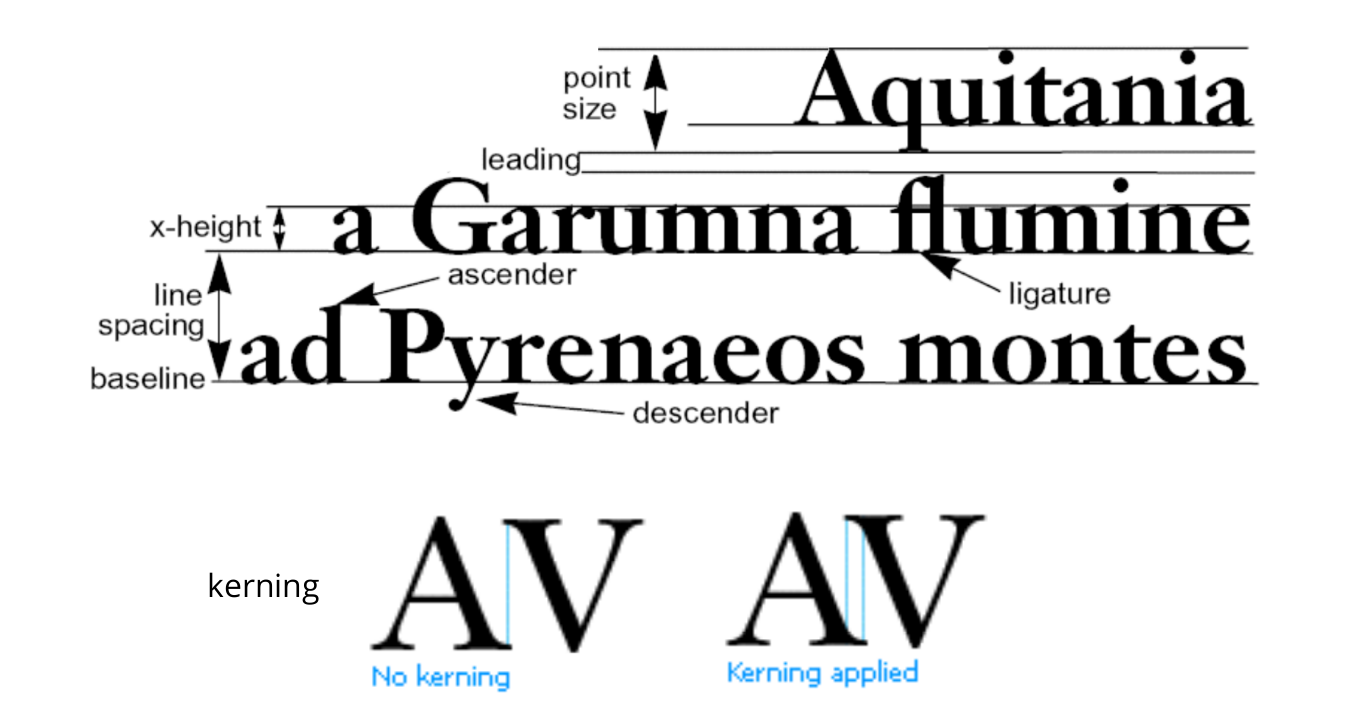
Typography
- The practice of arranging written subject matter
Difference between "Typeface" and "Font"
Style - the font family (e.g. Sans-serif, Serif etc)
- Weight - the "thickness" (e.g. bold)
- Emphasis - (e.g. italic)
- Point - "height" of the font - 0.351mm = 1/72" (mostly)
- Avoid using display typefaces like comic sans
- Don't use many typefaces
- Avoid underlining (use bold and italics)
- Avoid fully justified text
Simplicity
- Present the minimum amount of information to achieve maximum effect
- Functions are quickly recognized and understood
- Simplicity also aids recall
- Less to remember
Impact
- Good visual design can reduce human processing time
- Lodging information screens - a screen that tests human search time
- Redesigned by Tullis
- 1984
Aspect Ratio
- the ratio between the width and height
- Don't change the aspect ratio of an image
- Often distorts the image